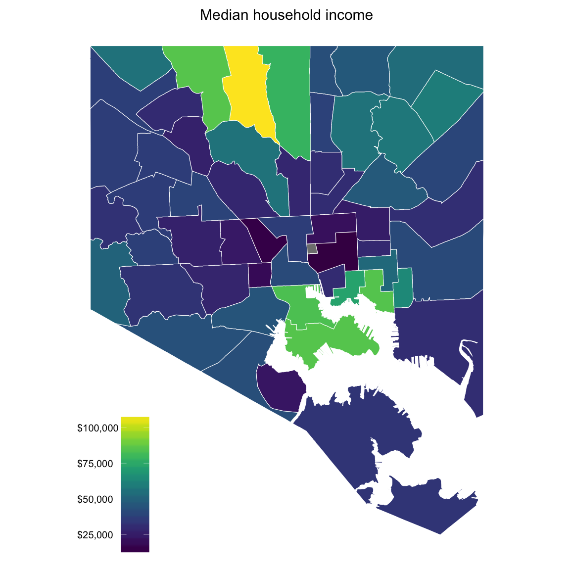
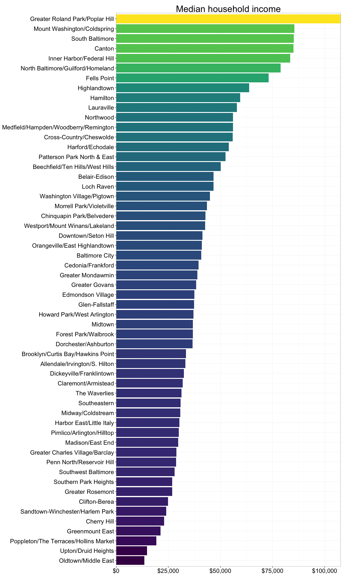
Baltimore Census: Income
This week’s post is a sobering look at the 2013 incomes reported in the recently release census. Having lived for five years in Sweden, one of the most egalitarian countries in the world and where it felt as if the majority of people fall around the median, I knew that Baltimore would be a dramatic contrast. Unfortunately, the data were not too surprising. The following graph shows median income levels across neighborhoods, and the bar graph presents a more relative comparison:
Thanks for tuning in. Coming up for the next post: crime and safety.